How To Choose The Right White
Selecting the ideal white paint for your home may sound like a straightforward task… until you stand before the paint swatch stand at the local hardware store and take in the visual assault of options. From cool and crisp to warm and inviting, the world of white paints offers a spectrum of possibilities that allows you to play with palettes and options that will work well with your space. But it can also be a cause for overwhelm. Which one is right? We’ll give you some guiding tips to make the process a little less daunting.
Cool Whites vs. Warm Whites:
Firstly, it’s important to note that there are generally two types of whites: warm and cool, and the distinction between the two lies in their underlying colour tones. Cool whites tend to have blue, green, or grey undertones, while warm whites have subtle undertones of yellow, pink / red, or beige. The impact of these undertones is quite powerful, and can help to determine the feeling or mood of the space.
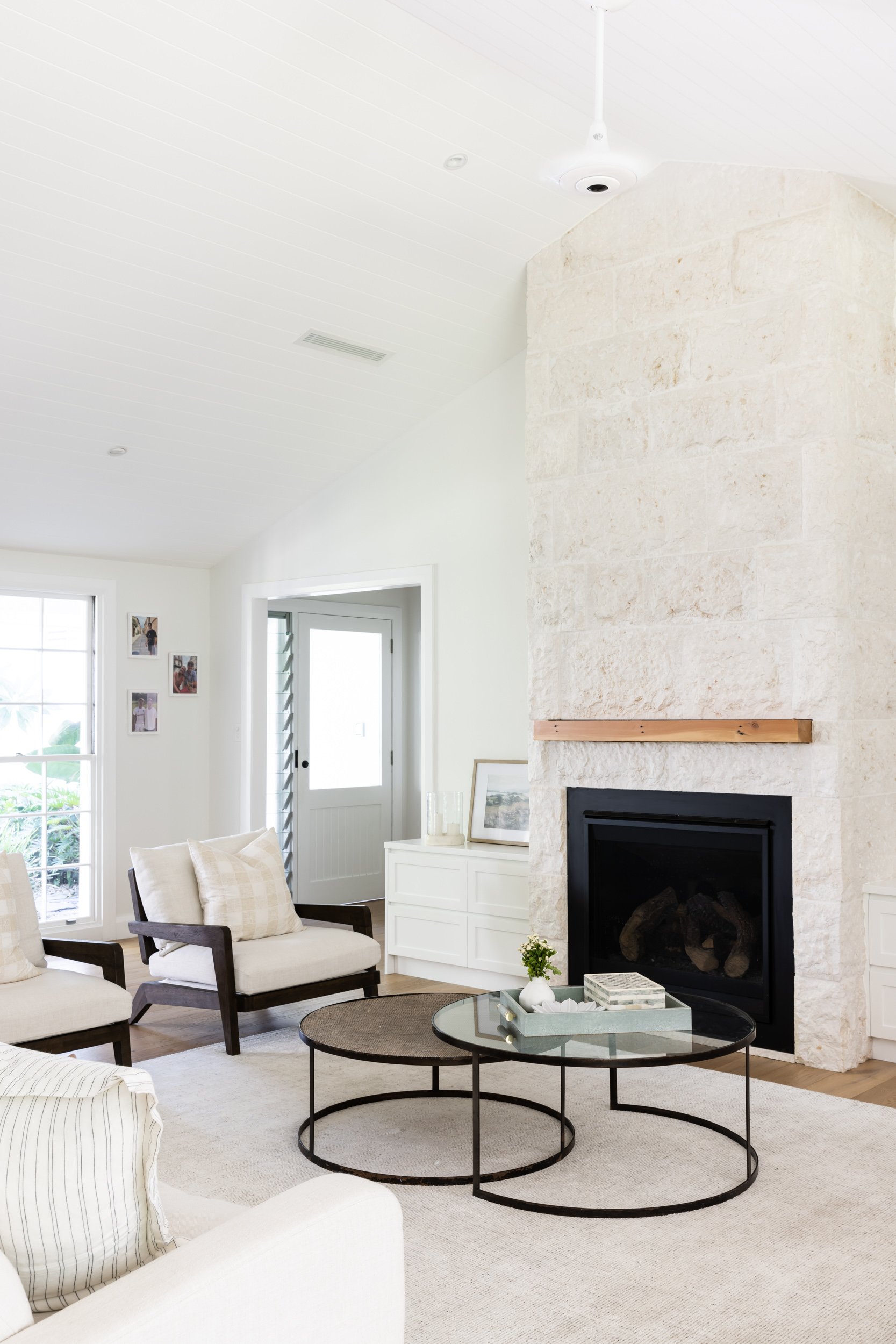
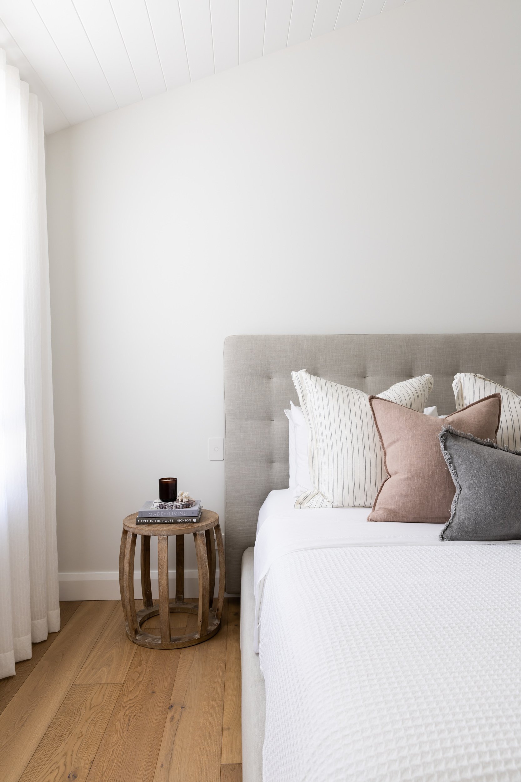
Whites on the warm side of the spectrum tend to feel cosier, more inviting and homely. The warm undertones can help create a soothing and calming environment, making it suitable for bedrooms, living rooms, and relaxation areas. Warm whites can evoke a sense of traditional or rustic charm to a space, and a feeling of nostalgia and familiarity.

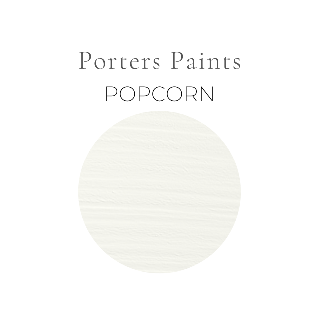
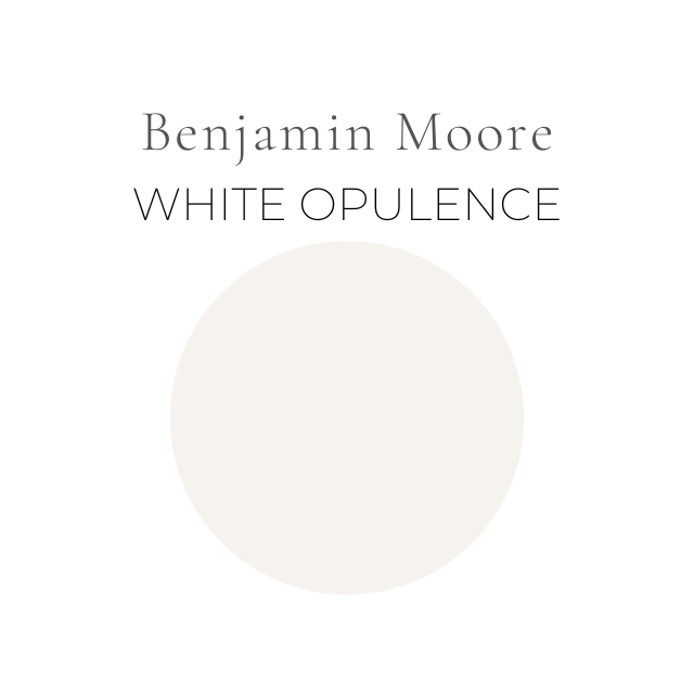
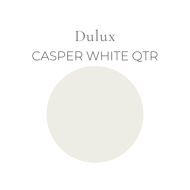
Warm White
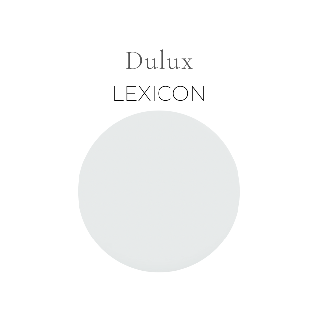
Cool White
Cool whites on the other hand can feel fresher and more energizing or airy. They can help improve focus and concentration, making it suitable for workspaces or areas where tasks requiring attention are performed. The bluish undertones of cool white can create an illusion of more space, making rooms feel larger and more open, and can also lend an impression of cleanliness and freshness, which can be ideal in spaces like kitchens and bathrooms.
Work With What You’ve Got
To work out if you need a warm white or a cool white, in addition to thinking about the mood you want to create, you’ll also need to consider the existing conditions of the space, including the size, its function, and the amount of natural light.
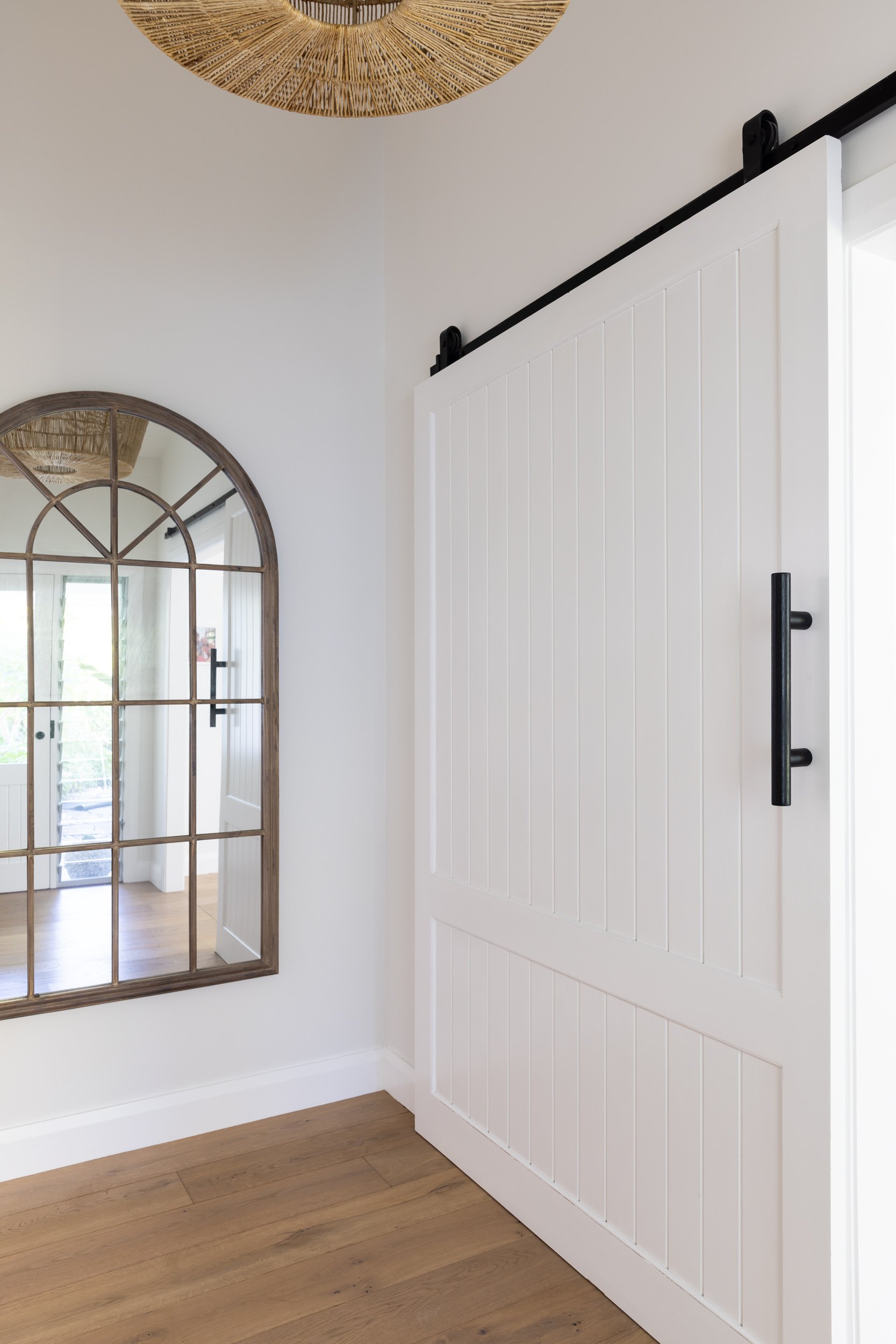
While white may seem like a neutral canvas, its subtle undertones will affect the way that white looks and behaves next to all the other elements in the room, such as flooring, window treatments, structural elements, natural light and furniture. For example, is the palette of flooring, window frames, window treatments etc already a cool (grey or blue-based) palette? If it is, a warm white may throw a lot of yellow when situated amongst that combination, and a cooler tone may work better.
Perhaps you're working with rustic hardwood, sleek marble, or earthy tiles. These foundational elements should guide your choice of white paint and its undertones, to ensure a cohesive aesthetic that resonates throughout the room. Make sure those paint swatches are viewed against all the other elements in the room. It will soon become obvious which whites feel balanced and which feel jarring against the existing palette.
The Power of Lighting:
Lighting is an often underestimated influencer when it comes to paint color selection. Natural and artificial light sources can dramatically alter how white paint appears on your walls. It's best to test potential paint swatches under different lighting conditions and on all walls to ensure the colour behaves the way you want it to in different situations. A cool white might appear stark under warm, incandescent lighting, while a warm white could look overly yellow under bright daylight. The key is to find balance by considering the lighting scenarios your room will typically encounter on any given day.
If it's a dark room, but a warm white feels right, opt for a lower strength for a brighter, more reflective option.
Checklist for a Successful White Paint Selection:
1. Create a Mood Board: Compile a mood board featuring paint swatches, flooring samples, fabric swatches, and decor elements. This visual aid will help you envision the final look and ensure a cohesive palette that feels balanced and resolved.

2. Sample First: Before committing to a full room makeover, test a few white paint samples on your walls. Observe how they interact with your flooring, furniture, and decor throughout the day. Tip: We suggest painting large pieces of white cardboard and blue-tacking those to the walls instead of brushing paint directly onto the walls. Those brush strokes may remain visible after the room is painted. Move the cardboard around to each wall under changing light conditions.
3. Factor in the Room's Purpose: The function of the room plays a significant role in white paint selection. A crisp cool white might be ideal for a modern kitchen, while a warm white could enhance the comfort of a bedroom.
4. Balance Undertones: To avoid clashes, aim to balance the undertones of your white paint with other colors in the room. This ensures a visually pleasing and harmonious environment.
5. Factor in Your Trims: Will you use the same white on your skirting boards and architraves? Or will you opt for some contrast and go for a crisper white on those trim areas? If it’s the latter, make sure the undertones of your trim white work with those on your walls. Tip: You’ll need a different paint finish for your woodwork compared to your walls. We love a semi gloss for these trim areas.
At the moment we are heavily into a warm white world in our projects, so we thought we’d share some of our current favourites with you here: