Designing with Colour for Longevity : How the Colour Palette of Our Homes Should Evolve as We Do
When we talk about ageing in place in Australia, the conversation typically centres on ramps, bathrooms and step-free entries. But longevity in residential design begins much earlier, and often far more subtly.
Colour is one of the most underestimated tools in future-ready home design.
As Australians live longer and increasingly choose to remain in their homes well into later life, the way we design for visual clarity, emotional comfort and long-term adaptability becomes critical. According to the Australian Institute of Health and Welfare, Australians aged 65 and over now represent around 16% of the population - a proportion projected to grow significantly over coming decades. At the same time, almost 1 in 10 Australians aged 55+ experience some degree of vision impairment.
This isn’t about designing for frailty. It’s about understanding that our visual and emotional needs evolve, and that good design should evolve with them.
How Ageing Eyes Influence Interior Design
From our mid-40s onwards, the eye’s lens gradually thickens and yellows. This affects:
Contrast sensitivity
Depth perception
Ability to distinguish between similar tones
Sensitivity to blue light
Colours may appear less vibrant. Subtle tonal variations can become harder to read. Low-contrast environments can feel visually flat or disorienting.
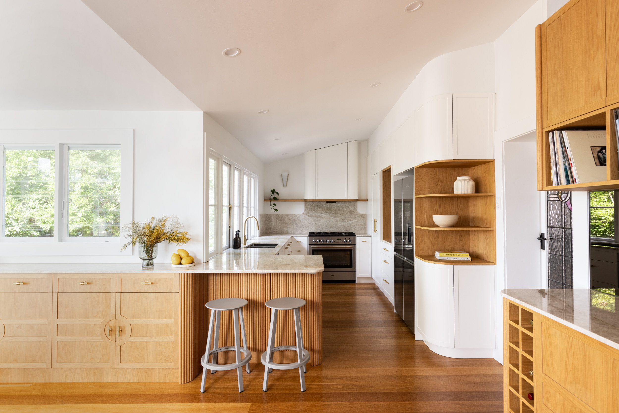
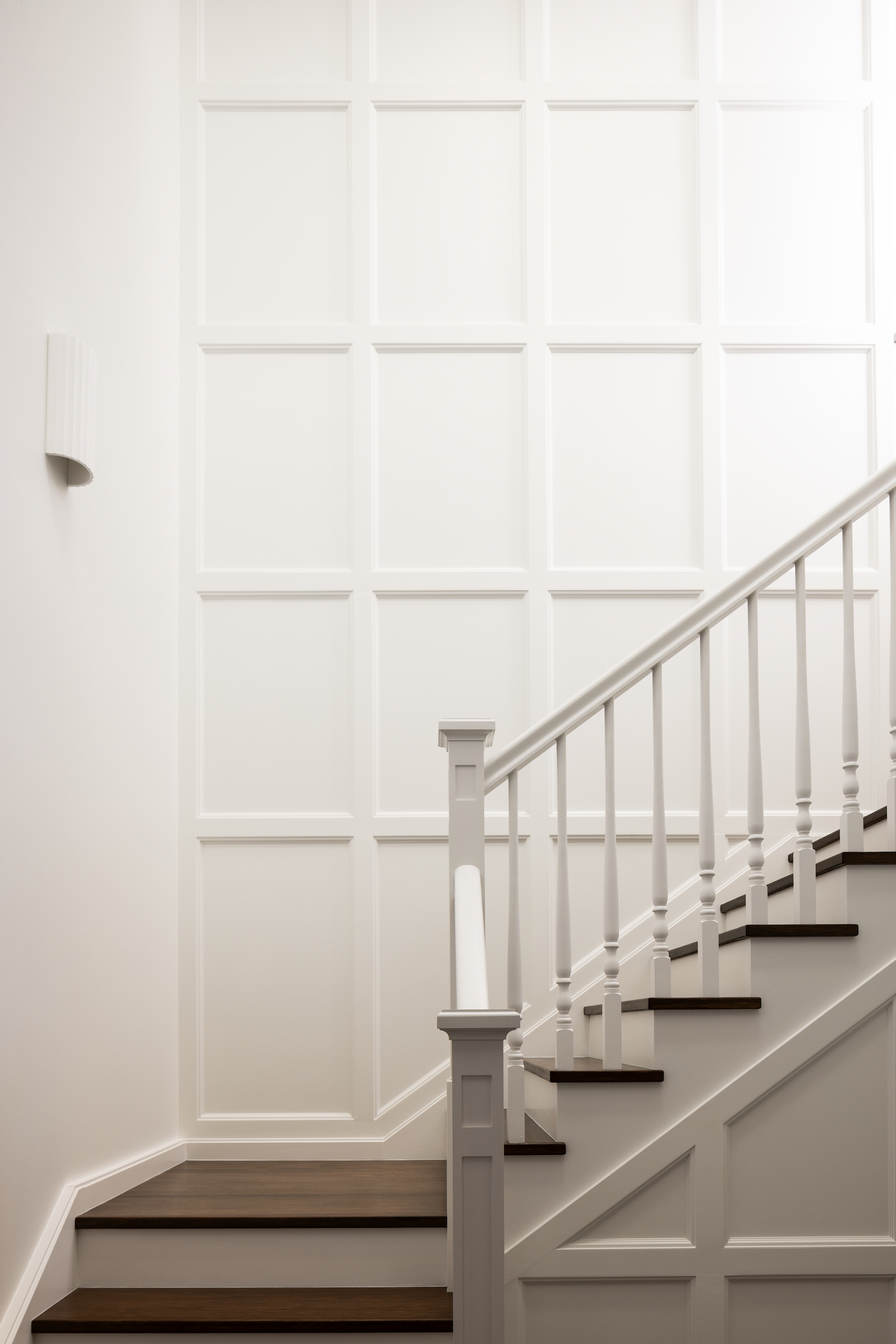
In practical terms, this means that longevity-focused interior design must consider aspects such as tonal differentiation between walls and floors, defined thresholds and stair edges, joinery that reads clearly against its backdrop, and lighting that enhances, rather than washes out, colour
It’s contrast, but not in a clinical interpretation. It’s about thoughtful layering.
Universal design principles often emphasise physical accessibility. But visual accessibility is equally important in over-55 home design, and far less frequently discussed.
The Psychology of Colour as We Enter the Next Chapter
Beyond physiology, colour plays a powerful emotional role. In our design practice, as clients move into new life stages, whether downsizing, welcoming adult children back home, or simply seeking a more settled pace, their appetite for colour often shifts. Not toward less colour, but toward more considered colour.
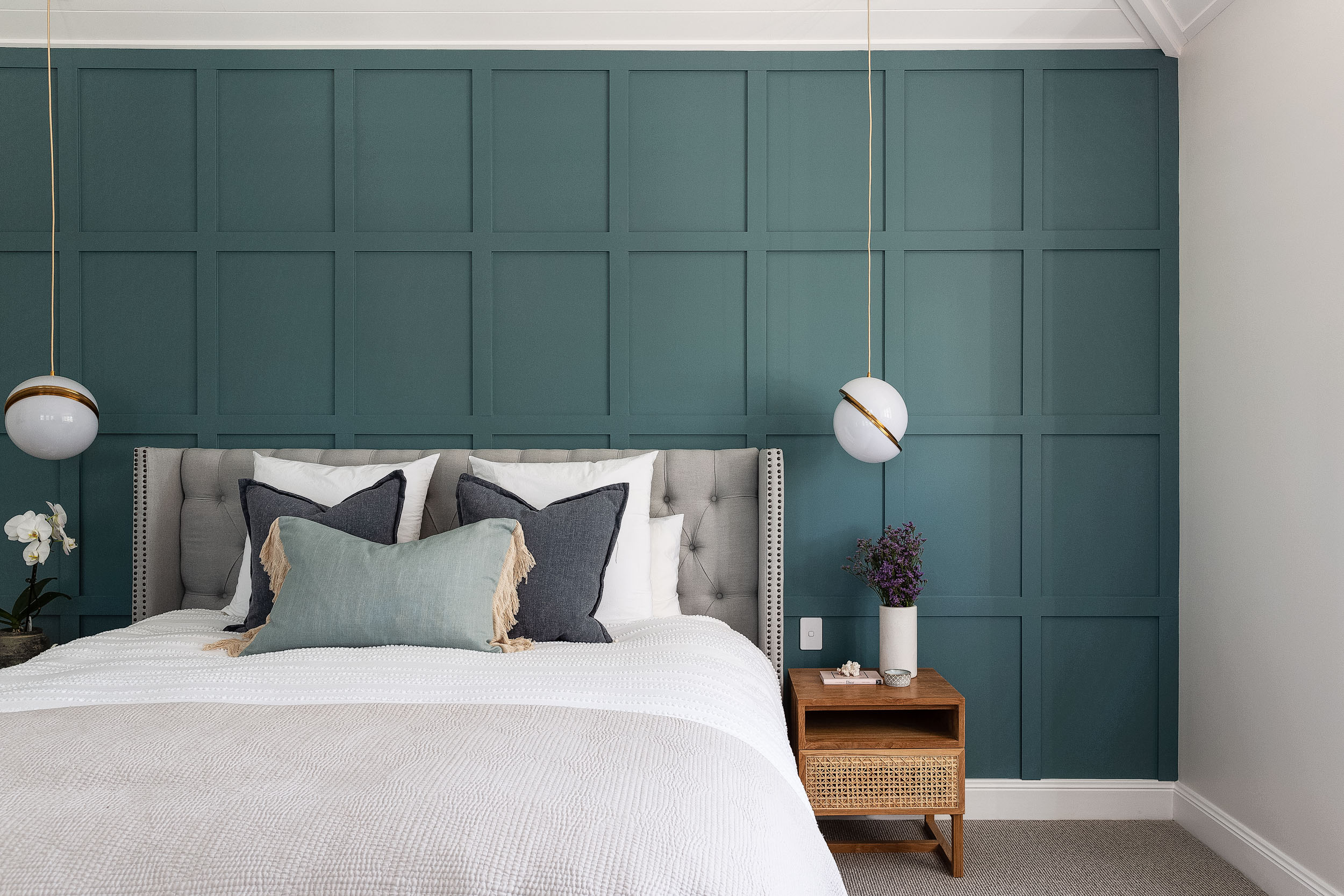
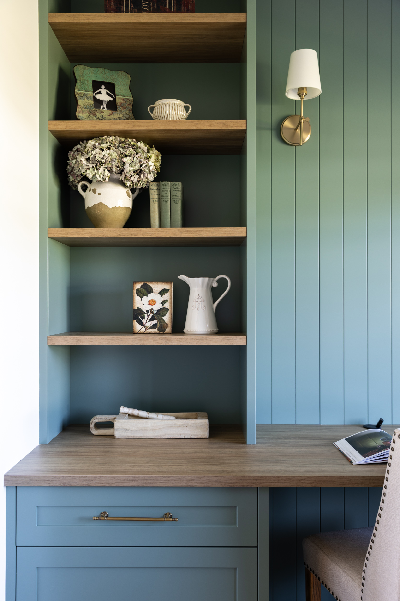
Blues & Greens: Restoration and Mental Clarity
Soft greens and muted blue-greys evoke calm and stability. In longevity-focused homes, these hues help create a sense of retreat, reduced visual stimulation (or clutter), and emotional grounding. Importantly, we aim for these colourways to carry some warmth, avoiding icy undertones that can appear dull under ageing light perception.
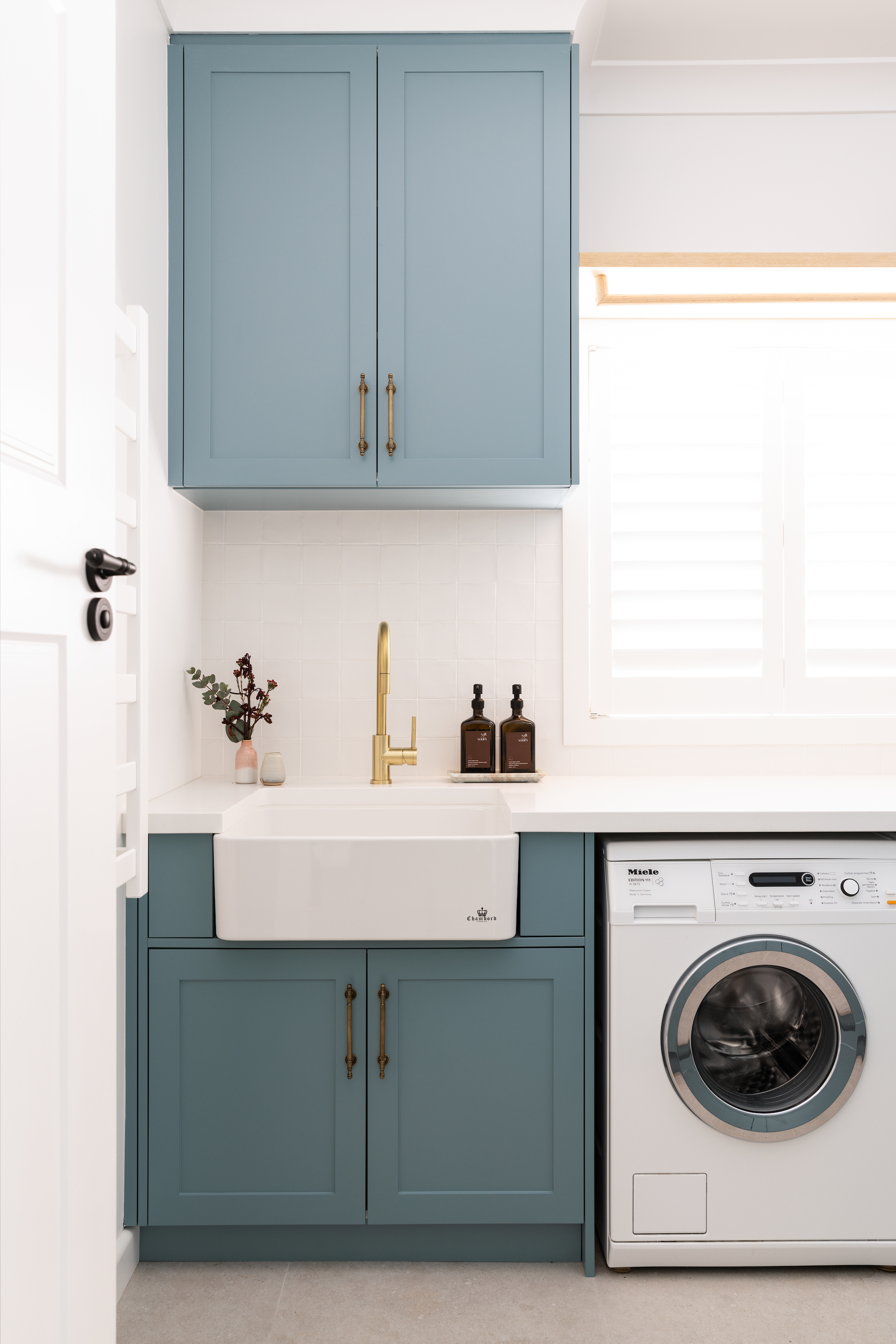
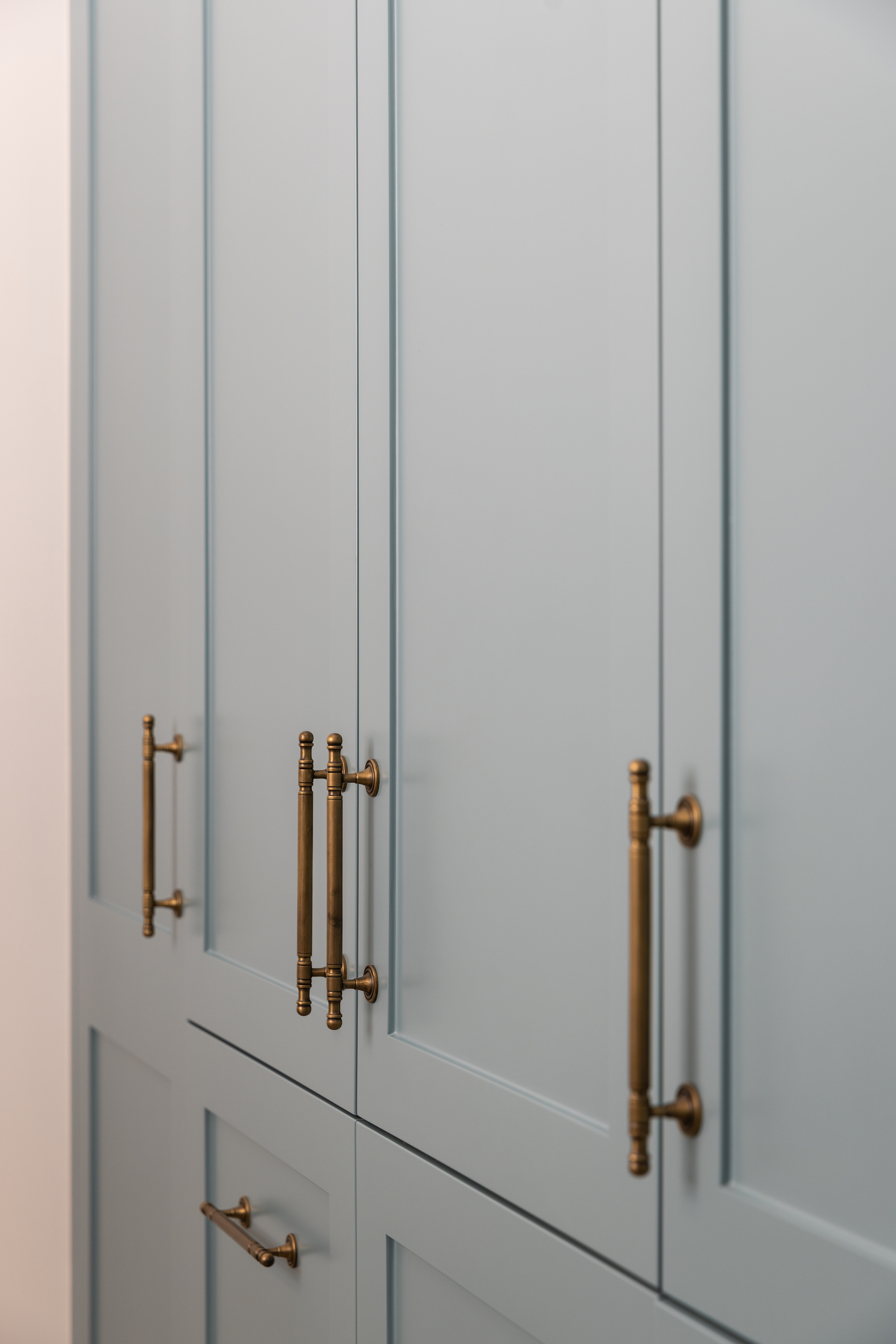
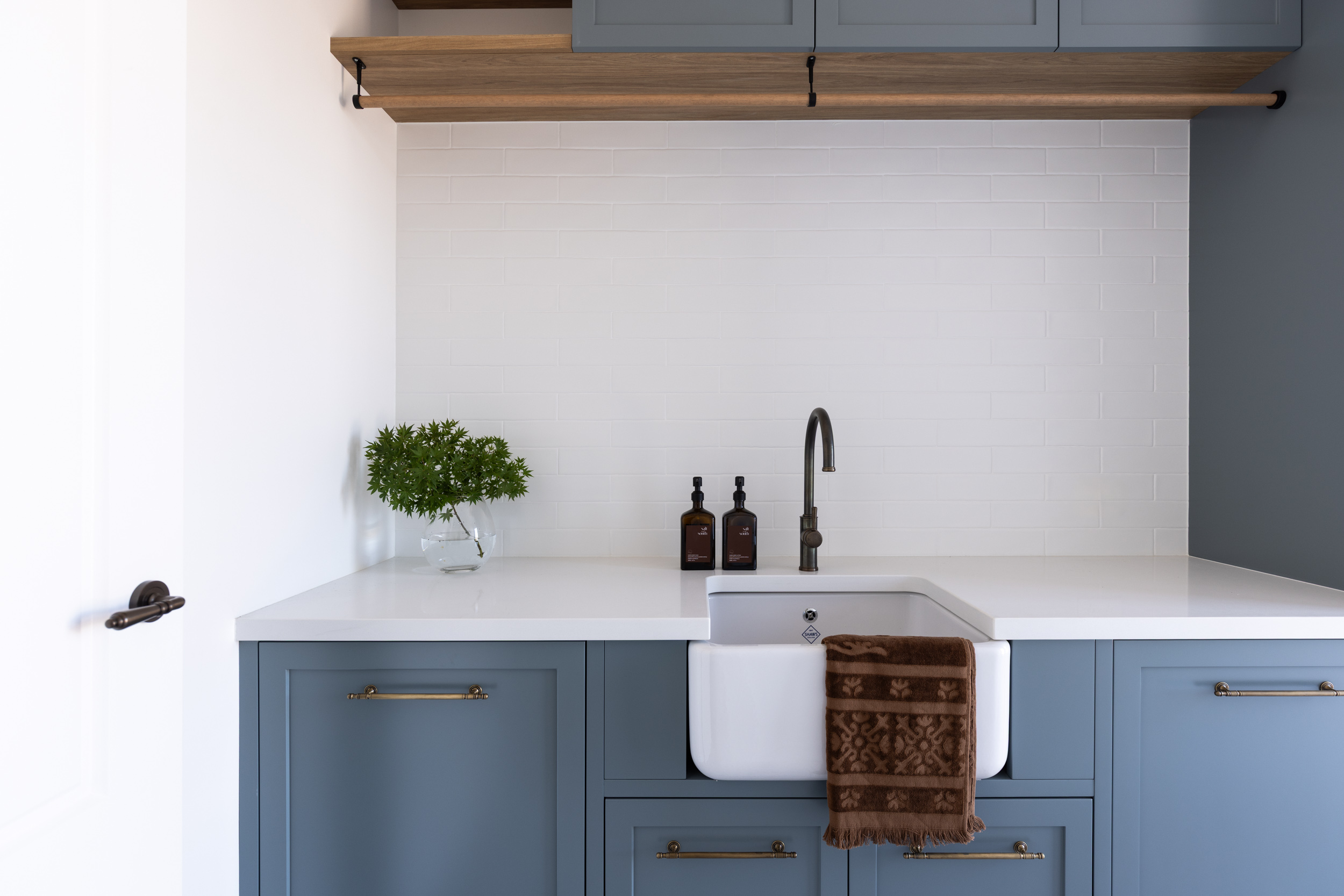
Earth-Based Neutrals: Permanence and Depth
Clay tones, warm taupes, mineral hues and natural timbers resonate strongly with homeowners seeking enduring design.
These colours can provide greater tonal depth and be a subtle way to improve visual contrast. Additionally, they can age well aesthetically and feel anchored and timeless rather than trend-driven. In ageing in place design, permanence often becomes more appealing than novelty.
Warm Tones: Orientation and Energy
Muted ochres, warm creams and soft terracottas can enhance spatial orientation and sociability, particularly in kitchens and shared living zones.
Warmer palettes are often easier to distinguish visually and can support a feeling of cosy comfort without overwhelming the senses.
Contrast as a Strategic Design Tool
One of the most effective longevity strategies is not a grab rail, it’s contrast. Not stark black-and-white contrast, but calibrated tonal shifts.
In our residential projects, this may include:
Cabinetry sitting one or two tones deeper than walls
Door frames defined without being dominant
Bathroom fixtures visible against their backdrop
Stair nosings subtly differentiated
Flooring transitions clearly articulated
These decisions are often not even noticed consciously, but they support confidence and independence over time.
Good ageing in place design should be invisible.
Designing Homes That Feel Resolved
In a more broader context, we’re seeing a shift in Australian design away from stark white minimalism and toward layered neutrals, material warmth and visual softness (but with depth). This shift aligns with what many homeowners in their 50s and 60s articulate: a desire for homes that feel resolved, not experimental.
Colour, when handled thoughtfully, can contribute quite significantly to the more practical elements of an interior such as wayfinding and reduced visual strain. It can also help provide emotional reassurance, and when more than 1 in 10 people aged over 65 experience depression, with rates even higher in residential aged care settings, this is particularly significant. (Source : Healthdirect)
Longevity in design is not about preparing for decline, it’s about designing homes that continue to support clarity, dignity and independence across life stages. And colour, often underestimated, is one of the most powerful tools we have to achieve that.